Tuesday, November 20, 2012

2000 Population Census


 This a population density map from the the 2000 Census.  What can be learned from a map of this type is not only where people live, but how populated it is in a particular area.  This map was used by importing information from the government, and with the colors used, it is easy to see the urban sprawl.  I like the map shown above as it shows how really open the west is.  The only drawback to reading this map, and some could say it is the best thing about it, is the color used for the least populated areas.  On most maps, the lightest shade of color is usually used to depict the lowest amount, but this map shows it in a very hideous color.  I guess if you want to move somewhere, where you will never see your neighbor, go to the darkest area on this map.
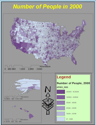

This map shows the general population of counties in the United States.  It is very easy to read, and the colors blend nicely to show the information that it is suppose to show.  Again, as stated about the density map, it also shows how open the western states are.  The only drawback that I can see about this map is there should be one or two more brackets used to show the population.  For instance, we all know that Denver, CO does not have the same population as Los Angeles, CA, but if you were an outsider from another country, you may come to that conclusion by looking at this map.

This map shows the general migration of humans away from the plains' states.  It is very easy to read and shows that people are moving towards the cities.  What this map doesn't do is show just how much.  It is crazy to think that just as many people moved to Central Florida, as they did to Chicago.  So for this reason, as the previous map, it could use an additional color or two to depict better movement.  After all, 40,000 to 951,100 is a big jump to compare to.  What is good about this map is that it shows how open the northern plains are becoming.  This is good for all the rich republicans buying land to go hunt and fish... And the reserves that being put in place.
This map is showing the same information as the previous map, just in different way.  Instead of showing the numbers, it is showing the percent change.  Therefore, the map does look slightly different.  When looking at the Las Vegas area, its real easy to see the growth that occurred in the 90's.  Another thing that is shown really well is the lack of population growth in the Midwest.  I like the color ramp, and the numbers used to break them down are not far off. 

Tuesday, November 13, 2012

Digital Elevation Model


Geographic location for the information to create this Digital Elevation Model (DEM) is about 60 miles west of Denver, CO.  More specifically, it is about one mile west of the famed (if you know this area) Rabbit Ears pass. The extent of map is: top is 39.829, bottom is 39.384, left is -105.789, and right is -104.969. The geographic coordinate system used is North American 1983.  The three posters featured are Aspect, Slope, and Hillshade.  The last poster is a three-dimensional showing of the terrain. 

Tuesday, November 6, 2012

Map Projections


For this assignment we were instructed to create two different styles of projections for the three most common types of maps. As is demonstrated in the posters below, there are numerous ways to present the world, a couple of them are quite aesthetically pleasing, and others are pretty boring; but none the less, there are reasons behind every projection. This assignment was fun for me in the way that the world can look many different ways, and still be the same.


The equidistant map can be used for a variety of reason. The main reason of use is for preserving the distance for measuring reasons. The main problem with this style of map creation, is the loss of real area and angles, as these are not preserved when making these map.


Equal area projection preserves the directions of continents and size of areas, but the northern and southern latitudes are misrepresentedThis is caused because this projection enhances the views of only the area size. Since only its area is preserved, it cannot be used for navigation like conformal maps or used to measure distance like equidistant maps. To me, the Bonne Projection above does a great job at preserving the world in terms of area size, but he Mollweide Projection does the best at conforming the map for better aesthetics.


Conformal map projections are the most common.  They are the type that is most used in classrooms and most likely to be used for any type of navigation purposes.  The main reason for this is because conformal maps preserve the lines of latitude and longitude.  By looking at the stereographic projection, it is easy to see the distance from the United States to Russia is shorter over the North Pole, but look at the size of Africa.  This is the reason there are other map projections. Conformal maps lack the preservation of area and distance.