Friday, October 26, 2012

ArcMap Tutorial Project


This map poster was created with ArcMap, which a program within ArcGIS. This project was to manipulate data that was already created for me, by going through a tutorial booklet.  The end result is displayed above, which to me was an learning, but fun, experience.  Now that I have been through the tutorial a couple of times, I look forward to creating more maps, and other projects that this program can make.

The things that make this program great are many.  For one, this program was created for use on a PC, which I am more accustomed to working with.  The program uses many dialog boxes that allow the use to know what to do next.  The layout is fantastic.  The user can set which toolbars he or she would like, and this is helpful by not having everything opened at the same time.  With the inclusion of this feature, the screen is more usable and can be seen more clearly.  Another portion of this program that I liked, is the ability to switch views and manipulate the data very quickly.  The changes that are requested to be made are instantly shown on the work area, and this is helpful when determining if you have taken the proper step, or if you need to redo the set of steps to complete the current task.

Now, for the bad, not every program is flawless.  After all, ArcGIS is on update 10.1, so they have acknowledged the need for a better product.  This product is made on a PC, which has drawbacks.  It is not as user friendly as could be made.  There are many buttons that need be clicked in order to complete certain steps.  The drawing capabilities are lacking.  I tried to draw free-hand, and I will admit that this was a terrible idea. It is done by dragging a mouse on area, and hopefully the end result is desirable, which mine was not. 

Overall, like I stated above, ArcGIS is a fun product and one that I liked working with.  I turned my time with the program into almost a video game, as I conquered the next step in the tutorial.  After I learned the nuances of the program, I became addicted to working with the program.  Sure AutoCad is thrown out numerous times to combat any drawing program available, but to me this program can surely do the job.  I enjoyed the project and I look forward to using the program many more times in the future.


Tuesday, October 16, 2012

NBA Pacific Division Map


View NBA Pacific Division in a larger map

For my lab assignment this week, I chose to display the five teams that make up the Pacific division of the Western Conference in the NBA. The teams, when placed on a map, can be shown to describe why the NBA chooses a geographic reference as a competitive division. Of course with the major trades this year, especially Nash to the Lakers, this year promises to bring forth more rivalries and exciting basketball. I wish that the Clippers would "kick rocks" and head to Orange County or San Diego, but this won't always be a perfect world. For this reason, I did place the Lakers more geographically correct.

 I enjoyed this assignment and like working with Google Maps. There are, however, pitfalls to creating a map online. The biggest problem, to me, is how the geographical reference of the item that is being placed can override another point of reference on the map. This is very frustrating when trying to place a point exactly where the should be. The other big problem with Google Maps is that this service lacks creativity. There aren't many things that can be changed on the maps. If I want to exclude particular things from the map, this cannot be done.

Tuesday, October 9, 2012

Beverly Hills Quadrangle

1) Beverly Hills

2) a) Canoga park
    b) Van Nuys
    c) Burbank
    d) Topanga
    e) Hollywood
    f) Venice
    g) Inglewood

3) 2012

4) North American Datum of 1983

5) 1:24000

6) a) 1200 meters
    b) 1.89 miles
    c)  2.64 inches
    d) 12.5 cm

7) 20 feet

8) a) 34o4'30"N 118o26'35"W   34.075°N and 118.402°W
    b) 34o0'30"N 11829'59"W   34.010°N and 118.409°W
    c) 34o6'10"N  118o24'50"W   34.103°N and 118.414°W

9) a) 560ft 170.7m
    b) 140ft  42.7m
    c) 680ft  207.3m

10) Grid 11

11) 3,763,200 Northing and 361,500 Easting

12) 1000000 sq. meters

13)


14) 12 Degrees

15) South

16)

Tuesday, October 2, 2012

Cool or Interesting Maps

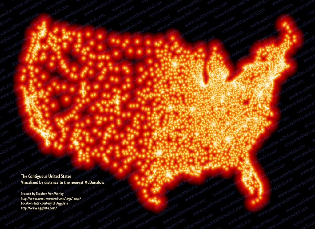
http://infomavensdesktop.files.wordpress.com/2010/01/mcd_map.jpg
  
 "McDonalds is Everywhere, and other cool Maps." Infomavens' Desktop. (2010): n. page. Web. 2 Oct. 2012. <http://infomavensdesktop.wordpress.com/2010/01/17/mcdonalds-is-everywhere-and-other-cool-maps/>.
What this map is showing is all the McDonald's restaurants that are in America, by representing them with a light on the map.  What is interesting to me about this map is that McDonald's has a great marketing team that realizes where to install new locations.  If this map was places next to a population density map, there would definitely be more similarities than differences.


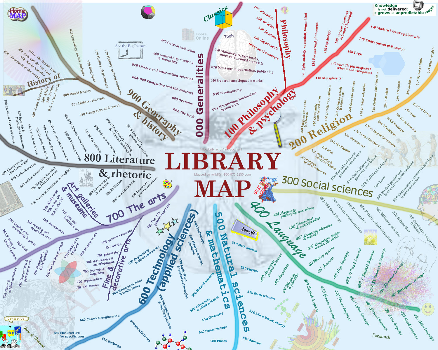
http://rkpjrhist615.files.wordpress.com/2007/09/librarymap.jpg

 "Use of Fonts…." WordPress. (2007): n. page. Web. 2 Oct. 2012. <http://rkpjrhist615.wordpress.com/2007/09/>.
While this map isn't a location based map, this is a great map to show the way that a library could be arranged.  There are many types of arrangement techniques put to use, but none of these techniques are as recognizable as the Dewey Decimal System.  This "original" blueprint for a library is finally put on a road map.


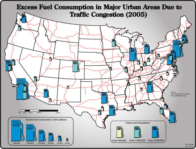
http://rkpjrhist615.files.wordpress.com/2007/11/finalprojdraft2.jpg

 "Meh…I couldn’t wait…." WordPress. (2007): n. page. Web. 2 Oct. 2012. <http://rkpjrhist615.wordpress.com/category/geography-310/>.
This map shows the excess fuel that is consumed by sitting in traffic.  This map is not only a great representation of how much time is wasted by traffic, but also the waste of fuel.  I like the little gas pumps as an identifier to the amount of fuel. This map hits home to our area as West Los Angeles is the place the be, and the result is the worst traffic around.